Multiple Predictors

Author

Biol 607

1. Multiple Linear Regression

Multiple linear regression is conceptually very similar to simple linear regression, but we need to be mindful of parsing apart the contribution of each predictor. Let’s use the keeley fire severity plant richness data to see it in action.

pacman::p_load(piecewiseSEM)
data(keeley)

head(keeley)
  distance elev  abiotic age   hetero firesev     cover rich
1 53.40900 1225 60.67103  40 0.757065    3.50 1.0387974   51
2 37.03745   60 40.94291  25 0.491340    4.05 0.4775924   31
3 53.69565  200 50.98805  15 0.844485    2.60 0.9489357   71
4 53.69565  200 61.15633  15 0.690847    2.90 1.1949002   64
5 51.95985  970 46.66807  23 0.545628    4.30 1.2981890   68
6 51.95985  970 39.82357  24 0.652895    4.00 1.1734866   34

For our purposes, we’ll focus on fire severity and plant cover as predictors.

1.1 Visualizing

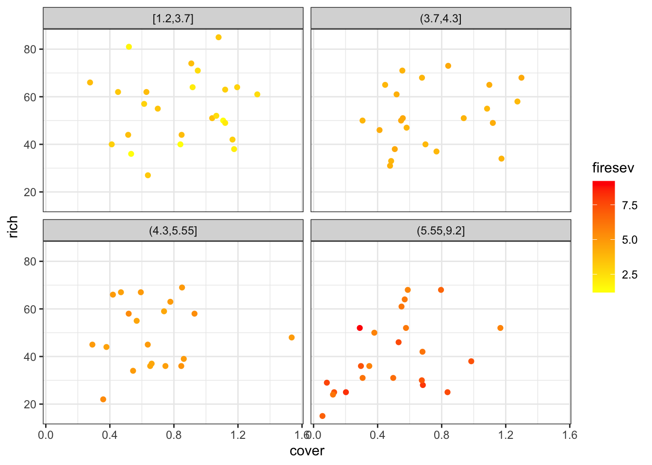
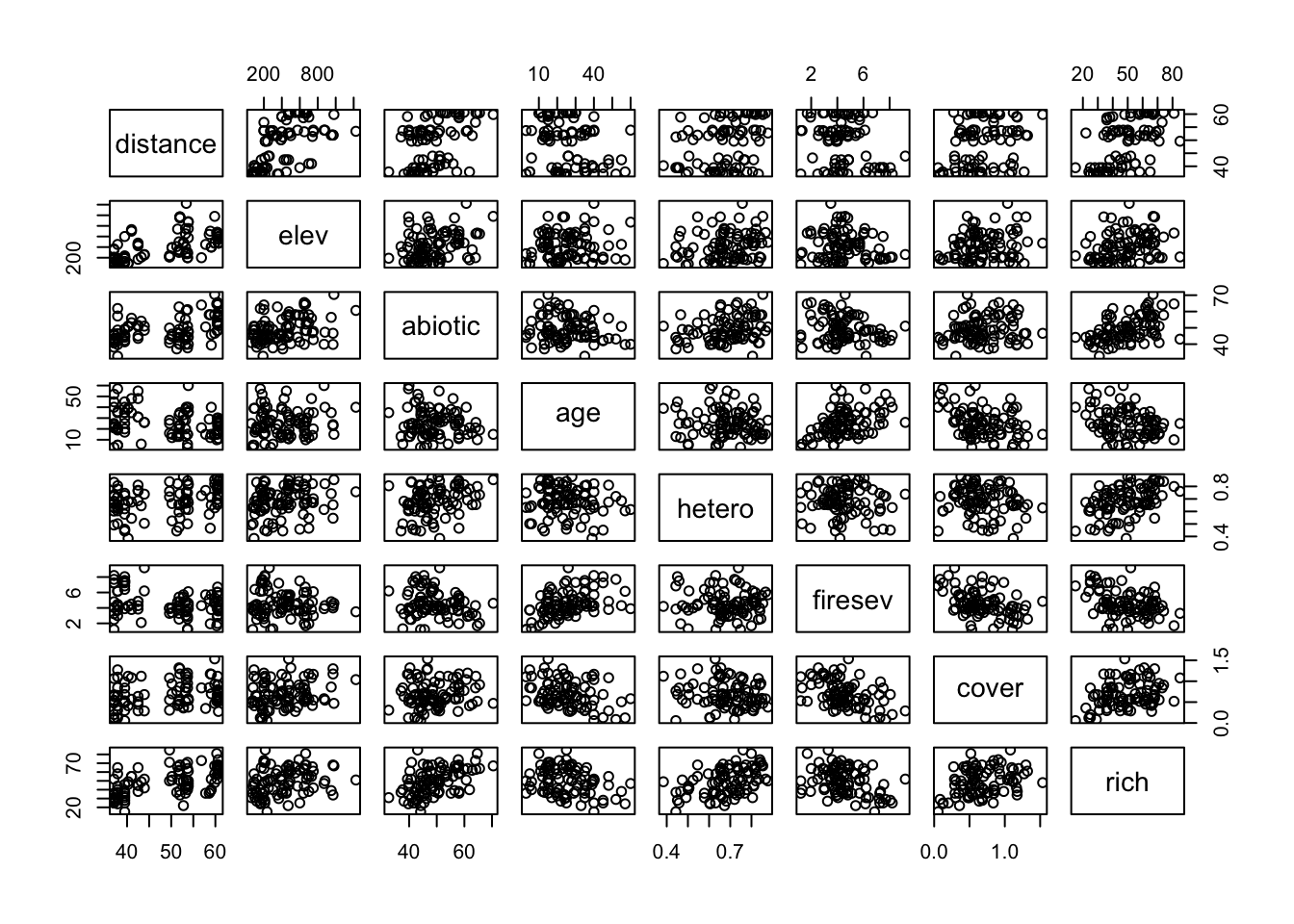
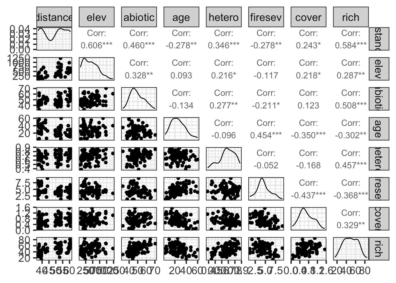
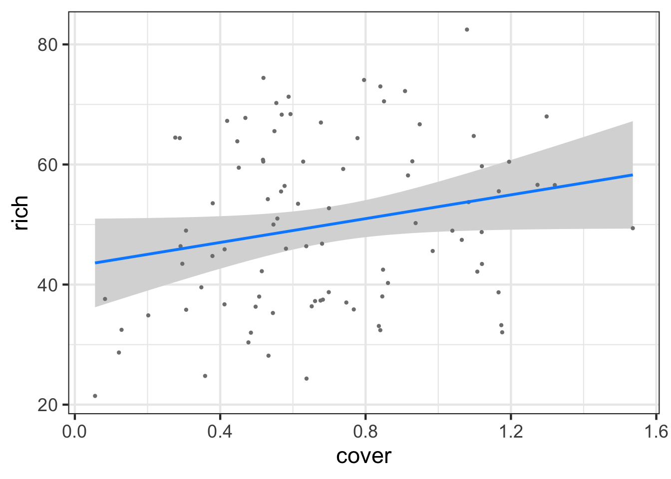
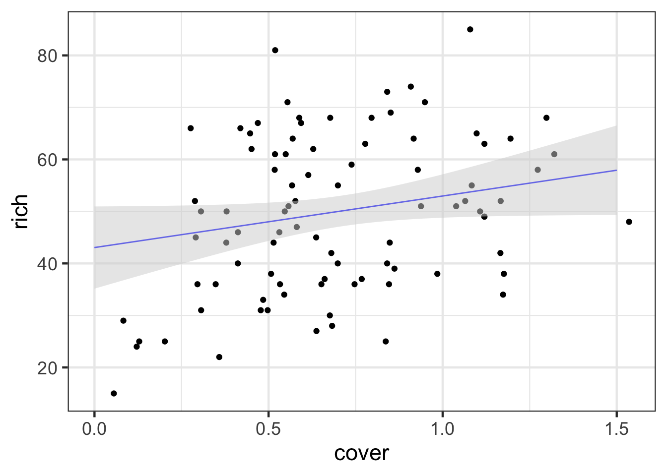
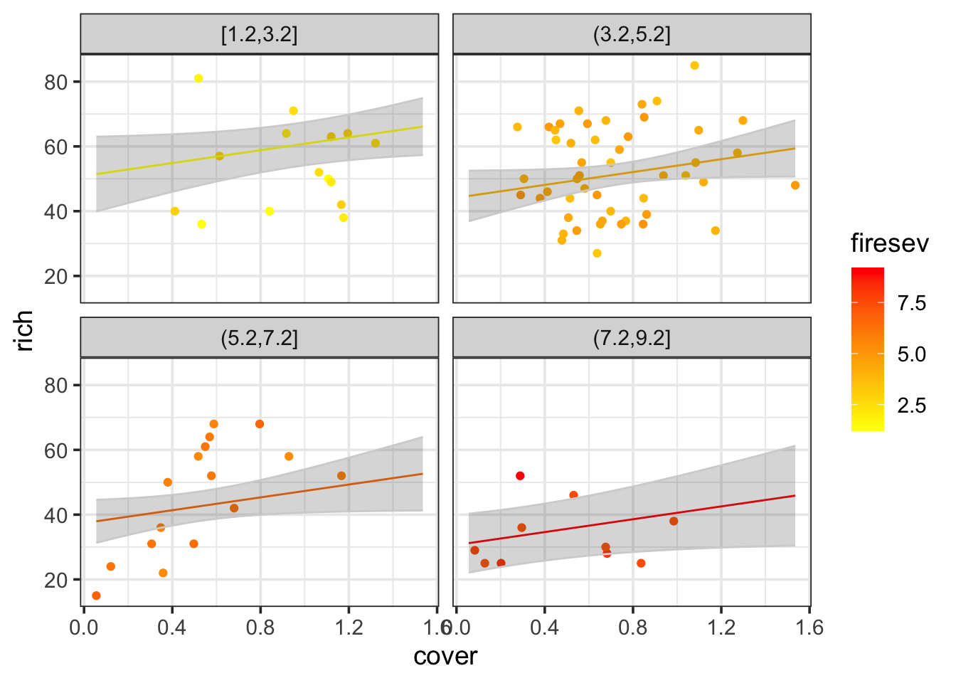
I’m not going to lie, visualizing multiple continuous variables is as much of an art as a science. One can use colors and sizes of points, or slice up the data into chunks and facet that. Here are a few examples.

library(ggplot2)

ggplot(data = keeley,
       aes(x = cover, y = rich, color=firesev)) +
  geom_point() +
  scale_color_gradient(low="yellow", high="red") +
  theme_bw() +
  facet_wrap(vars(cut_number(firesev, 4)))

We can also look at everything!

pairs(keeley)

I’m a bigger fan of a more information rich display. The GGally package has a lot of neat extensions to ggplot2, including the ggpairs() function.

library(GGally)
ggpairs(keeley)

What other plots can you make?

1.2 Fit and Evaluate Assumptions

Fitting is straightforward for an additive MLR model. It’s just a linear model!

keeley_mlr <- lm(rich ~ firesev + cover, data=keeley)

As for assumptions, we have the usual

library(performance)
check_model(keeley_mlr)

But now we also need to think about how the residuals relate to each predictor. Fortunately, there’s still residualPlots() in car.

library(car)
residualPlots(keeley_mlr, test=FALSE)

Odd bow shape - but not too bad. Maybe there’s an interaction? Maybe we want to log transform something? Who knows!

We also want to look at multicollinearity. There are two steps for that. First, the vif

check_collinearity(keeley_mlr) |> plot()

Not bad. We might also want to look at the correlation matrix. dplyr can help us here as we want to select down to just relevant columns.

library(dplyr)

keeley |>
  dplyr::select(firesev, cover) |>
  cor()
           firesev      cover
firesev  1.0000000 -0.4371346
cover   -0.4371346  1.0000000

Also, not too bad! Well within our range of tolerances.

1.3 Evaluation

What about those coefficients?

library(broom)
tidy(keeley_mlr)
# A tibble: 3 × 5
  term        estimate std.error statistic  p.value
  <chr>          <dbl>     <dbl>     <dbl>    <dbl>
1 (Intercept)    53.9      7.04       7.66 2.45e-11
2 firesev        -2.53     0.993     -2.55 1.25e- 2
3 cover           9.91     5.17       1.92 5.85e- 2

OK, but which one is more strongly associated with our response?

library(effectsize)

standardize_parameters(keeley_mlr)
# Standardization method: refit

Parameter   | Std. Coef. |         95% CI
-----------------------------------------
(Intercept) |   2.66e-17 | [-0.19,  0.19]
firesev     |      -0.28 | [-0.49, -0.06]
cover       |       0.21 | [-0.01,  0.42]

Note, this uses refit as the default method, where it basically refits the entire model with z-transformed parameters. You can use method = "basic" for simple models as well. Refit is nice, though, for more complex models. Just make sure you know what R is doing!

And then the R2

r2(keeley_mlr)
# R2 for Linear Regression
       R2: 0.170
  adj. R2: 0.151

Not amazing fit, but, the coefficients are clearly different from 0.
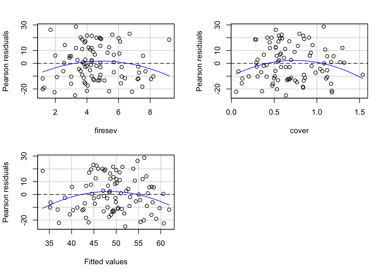
1.4 Visualization

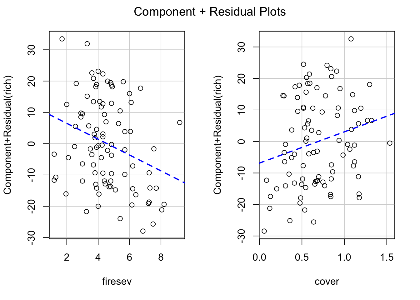
This is where things get sticky. We have two main approaches. First, visualizing with component + residual plots

crPlots(keeley_mlr, smooth=FALSE)

But the values on the y axis are….odd. We get a sense of what’s going on and the scatter after accounting for our predictor of interest, but we might want to look at, say, evaluation of a variable at the mean of the other.

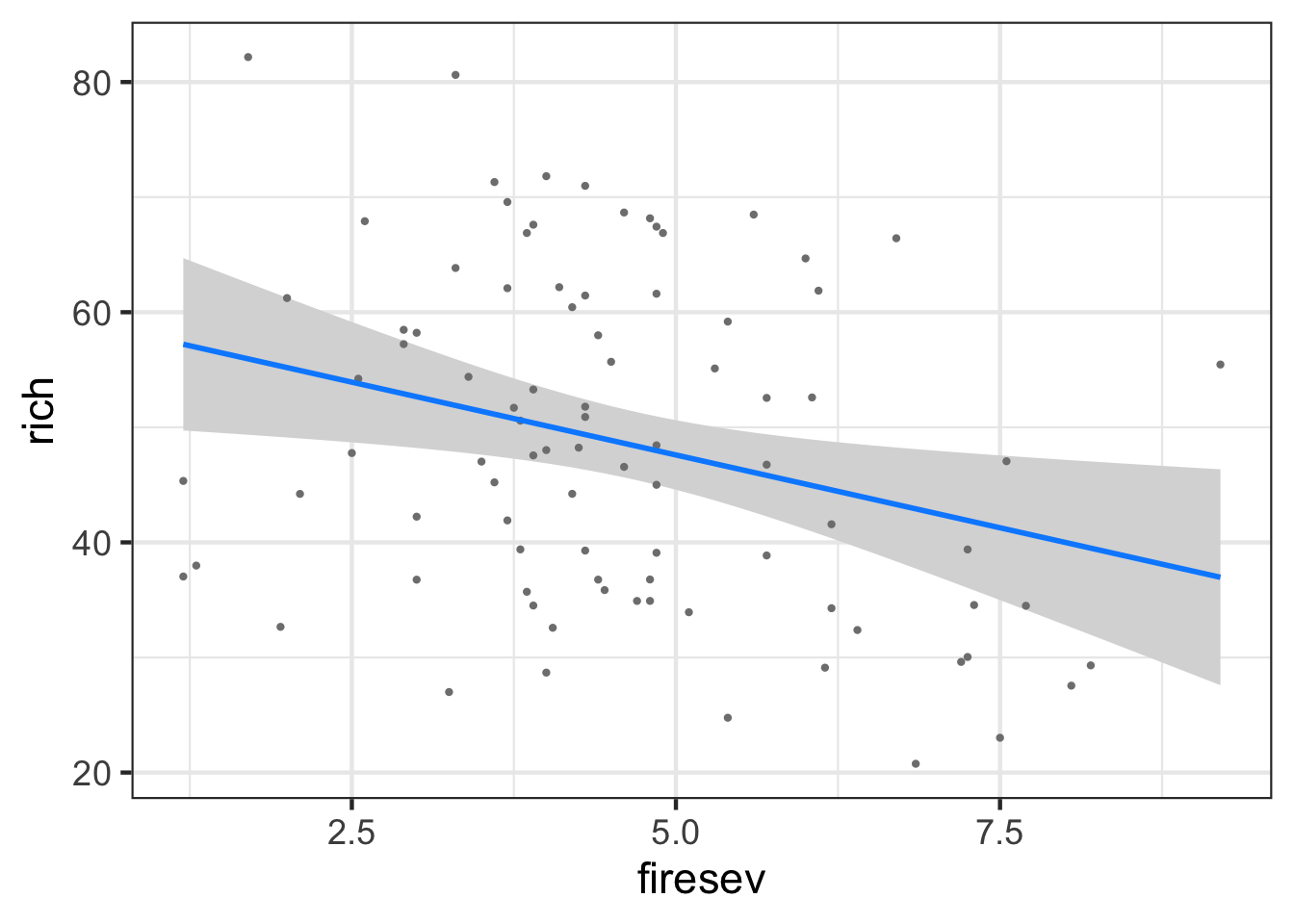
For that, we have visreg

library(visreg)
visreg(keeley_mlr, gg = TRUE)
[[1]]


[[2]]

Now the axes make far more sense, and we have a sense of the relationship.

1.5 Counterfactual Plots and Advanced Visualization

We can actually whip this up on our own using the median of each value, and broom::augment().

k_med_firesev <- data.frame(firesev = median(keeley$firesev),
                                 cover = seq(0,1.5, length.out = 100)) |>
  augment(keeley_mlr, newdata = _, 
                         interval = "confidence") 
  
  
ggplot() +
  geom_point(data=keeley, 
             mapping = aes(x=cover, y = rich)) +
  geom_line(data = k_med_firesev, 
            mapping=aes(x=cover, y=.fitted), 
            color="blue") +
  geom_ribbon(data = k_med_firesev, mapping = aes(x=cover, 
                                                  ymin = .lower,
                                                  ymax = .upper),
              fill="lightgrey", alpha=0.5)

Or, we can use modelr to explore the model and combine that exploration with the data. Let’s get the curve for cover at four levels of fire severity. We’ll use both modelr::data_grid and broom::augment for a nice easy workflow.

library(modelr)

k_firesev_explore <- data_grid(keeley,
                               cover = seq_range(cover, 100),
                               firesev = seq_range(firesev, 4)) |>
  augment(keeley_mlr, newdata = _, interval = "confidence") |>
  rename(rich = .fitted)

We can then use this to visualize the predictions with different slices of the data

ggplot(data=keeley,
             mapping = aes(x=cover, y = rich, color = firesev)) +
  geom_point() +
  geom_line(data = k_firesev_explore, aes(group = firesev)) +
  geom_ribbon(data = k_firesev_explore, 
              aes(group = firesev, ymin = .lower, ymax = .upper),
              color = "lightgrey", alpha = 0.2) +
  scale_color_gradient(low="yellow", high="red") +
  facet_wrap(vars(cut_interval(firesev, 4))) +
  theme_bw(base_size = 14)

1.6 Faded Examples

Let’s go through some faded examples from data from the Data4Ecologists package.

pacman::p_load_gh("jfieberg/Data4Ecologists")

First, here’s that keeley analysis again.

# Load the data
data(keeley)

# Perform a preliminary visualization 
keeley |>
  select(cover, distance, hetero) |>
  GGally::ggpairs()

# Fit a MLR model
cover_mod <- lm(cover ~ distance + hetero, data = keeley)

# Test Assumptions and modify model if needed
check_model(cover_mod)

# Evaluate results
tidy(cover_mod)

# Visualize results
visreg(cover_mod)
# Load the data
data(RIKZdat)

# Perform a preliminary visualization 
RIKZdat |>
  select(Richness, NAP, humus) |>
  GGally::_____()

# Fit a MLR model
rikz_mod <- lm(Richness ~ NAP + humus, data = RIKZdat)

# Test Assumptions and modify model if needed
_____(rikz_mod)

# Evaluate results
tidy(_____)

# Visualize results
_____(rikz_mod)
# Load the data
data(Kelp)

# Perform a preliminary visualization 
Kelp |>
  ____::_____()

# Fit a MLR model
kelp_mod <- lm(Response ~ OD + BD + LTD + W, data = Kelp)

# Test Assumptions and modify model if needed
_____(______)

# Evaluate results
_____(_____)

# Visualize results
_____(kelp_mod)

2. Categorical Predictors

Comparing means are among the most frequently used tests in data analysis. Traditionally, they were done as a T-test or ANOVA, but, really, these are just subsets of linear models. So, why not fit the appropriate linear model, and go from there! They’re delightfully simple, and provide a robust example of how to examine the entire workflow of a data analysis. These are steps you’ll take with any analysis you do in the future, no matter how complex the model!

For two means, we want to fit a model where our categorical variable is translated into 0s and 1s. That corresponds to the following model:

\[y_i = \beta_0 + \beta_1 x_i + \epsilon_i\]

Here, \(\beta_0\) corresponds to the mean for the group that is coded as 0 and \(\beta_1\) is the difference between the two groups. If \(\beta_1\) is different than 0, then the two groups are different, under a frequentist framework.

For many categories, we just extend this framework for

\[y_i = \beta_0 + \sum^K_{j = 1} \beta_j x_{ij} + \epsilon_i\] where now we have a reference group and then we look at the deviation from that reference for each other level of the category.

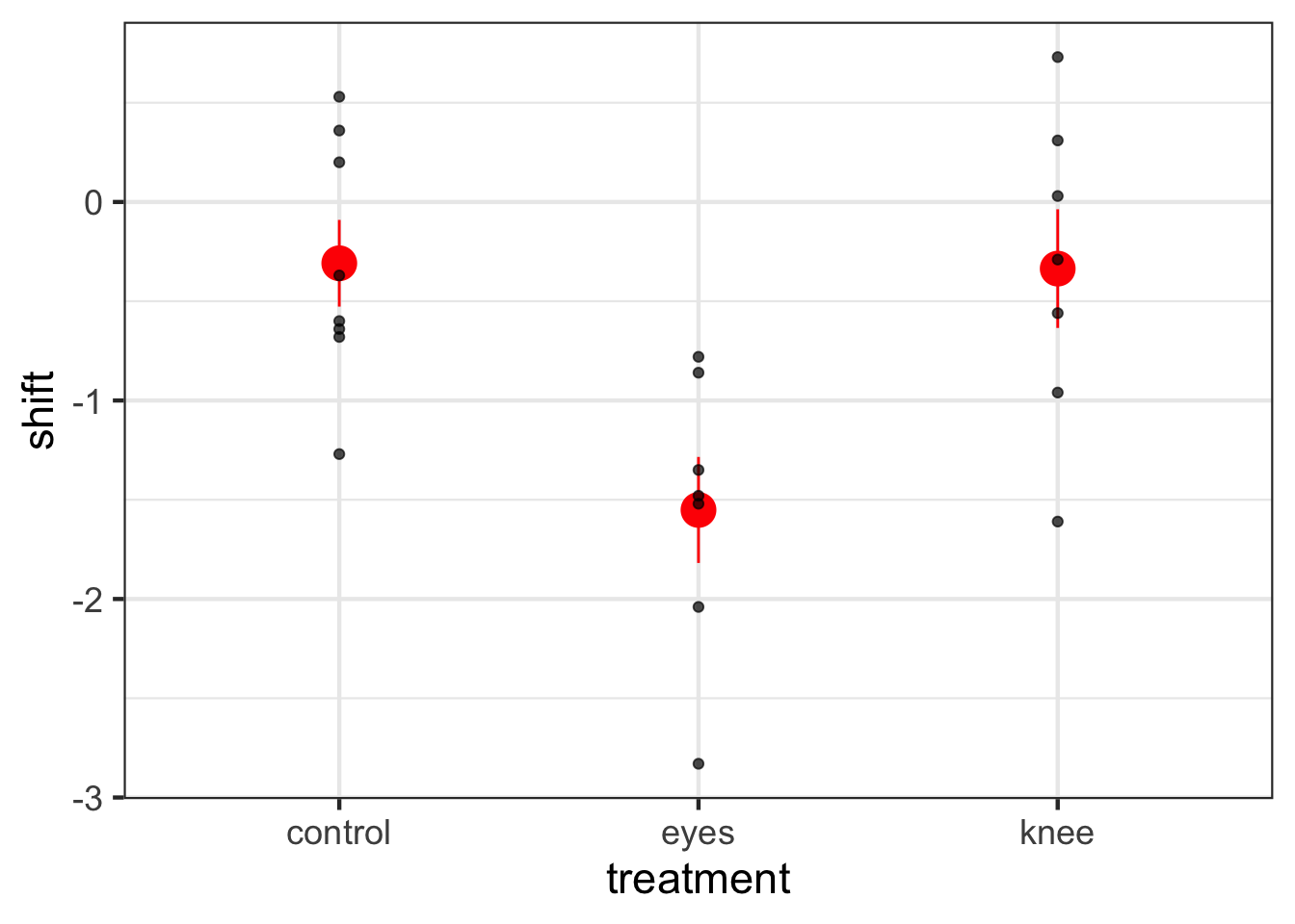
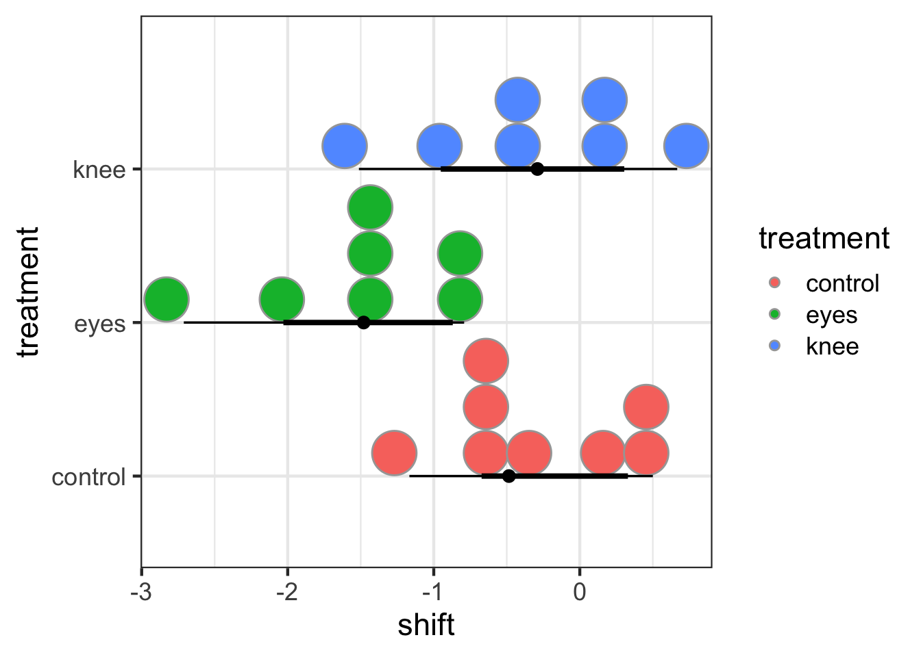
To see how this works with many categories, as comparing two means is just a simple subset of this analysis, let’s look at the dataset 15e1KneesWhoSayNight.csv about an experiment to help resolve jetlag by having people shine lights at different parts of themselves to try and shift their internal clocks.

knees <- read_csv("lab/data/10/15e1KneesWhoSayNight.csv")

We can see the outcomes with ggplot2

ggplot(knees, mapping=aes(x=treatment, y=shift)) +
  stat_summary(color="red", size=1.3) +
    geom_point(alpha=0.7) +
  theme_bw(base_size=17)

2.1 LM and Many Categories

As the underlying model of ANOVA is a linear one, we fit ANOVAs using lm() just as with linear regression.

knees_lm <- lm(shift ~ treatment, data=knees)

Note that treatment is a either a character or factor. If it is not, because we are using lm(), it will be fit like a linear regression. So, beware!

We can see how this was turned into dummy coding with model.matrix()

model.matrix(knees_lm)
   (Intercept) treatmenteyes treatmentknee
1            1             0             0
2            1             0             0
3            1             0             0
4            1             0             0
5            1             0             0
6            1             0             0
7            1             0             0
8            1             0             0
9            1             0             1
10           1             0             1
11           1             0             1
12           1             0             1
13           1             0             1
14           1             0             1
15           1             0             1
16           1             1             0
17           1             1             0
18           1             1             0
19           1             1             0
20           1             1             0
21           1             1             0
22           1             1             0
attr(,"assign")
[1] 0 1 1
attr(,"contrasts")
attr(,"contrasts")$treatment
[1] "contr.treatment"

Note that now we have an intercept and two 0/1 variables!

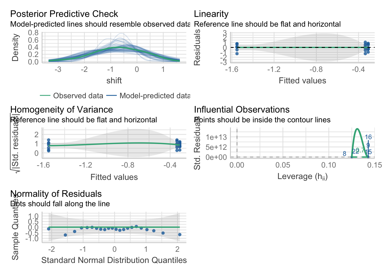
2.2 Assumption Evaluation

Because this is an lm, we can check our assumptions as before - with one new one. First, some oldies but goodies.

check_model(knees_lm)

Looks good! You can of course dig into individual plots and assumptions as above, bot, broadly, this seems good.

2.3 Evaluating Model Results

So, there are a lot of things we can do with a fit model

2.3.1 Summary Output

summary(knees_lm)

Call:
lm(formula = shift ~ treatment, data = knees)

Residuals:
     Min       1Q   Median       3Q      Max 
-1.27857 -0.36125  0.03857  0.61147  1.06571 

Coefficients:
              Estimate Std. Error t value Pr(>|t|)   
(Intercept)   -0.30875    0.24888  -1.241  0.22988   
treatmenteyes -1.24268    0.36433  -3.411  0.00293 **
treatmentknee -0.02696    0.36433  -0.074  0.94178   
---
Signif. codes:  0 '***' 0.001 '**' 0.01 '*' 0.05 '.' 0.1 ' ' 1

Residual standard error: 0.7039 on 19 degrees of freedom
Multiple R-squared:  0.4342,    Adjusted R-squared:  0.3746 
F-statistic: 7.289 on 2 and 19 DF,  p-value: 0.004472

First, notice that we get the same information as a linear regression - including \(R^2\) This is great, and we can see about 43% of the variation in the data is associated with the treatments. We also get coefficients, but, what do they mean?

Well, they are the treatment contrasts. Not super useful. R fits a model where treatment 1 is the intercept, and then we look at deviations from that initial treatment as your other coefficients. It’s efficient, but, hard to make sense of. To not get an intercept term, you can refit the model without the intercept. You can fit a whole new model with -1 in the model formulation.

knees_lm_no_int <- update(knees_lm, formula = . ~ . -1)

summary(knees_lm_no_int)

Call:
lm(formula = shift ~ treatment - 1, data = knees)

Residuals:
     Min       1Q   Median       3Q      Max 
-1.27857 -0.36125  0.03857  0.61147  1.06571 

Coefficients:
                 Estimate Std. Error t value Pr(>|t|)    
treatmentcontrol  -0.3087     0.2489  -1.241    0.230    
treatmenteyes     -1.5514     0.2661  -5.831 1.29e-05 ***
treatmentknee     -0.3357     0.2661  -1.262    0.222    
---
Signif. codes:  0 '***' 0.001 '**' 0.01 '*' 0.05 '.' 0.1 ' ' 1

Residual standard error: 0.7039 on 19 degrees of freedom
Multiple R-squared:  0.6615,    Adjusted R-squared:  0.6081 
F-statistic: 12.38 on 3 and 19 DF,  p-value: 0.0001021

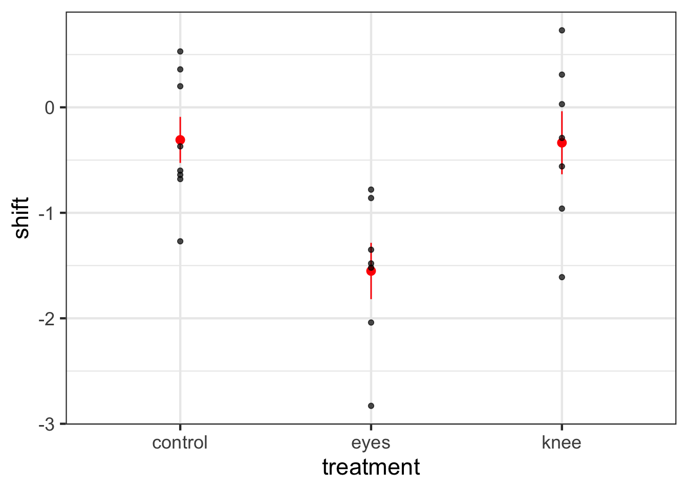
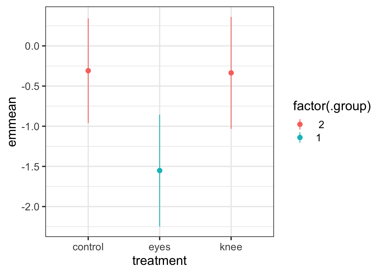
OK - that makes more sense. But, ugh, who wants to remember that. Instead, we can see treatment means using the emmeans package yet again.

emmeans(knees_lm, ~treatment)
 treatment emmean    SE df lower.CL upper.CL
 control   -0.309 0.249 19   -0.830    0.212
 eyes      -1.551 0.266 19   -2.108   -0.995
 knee      -0.336 0.266 19   -0.893    0.221

Confidence level used: 0.95 

I also like this because it outputs CIs.

2.3.2 Model Visualization

The plot from above really sums this work up.

ggplot(knees, mapping=aes(x=treatment, y=shift)) +
  stat_summary(fun.data = "mean_se", color="red") +
    geom_point(alpha=0.7)

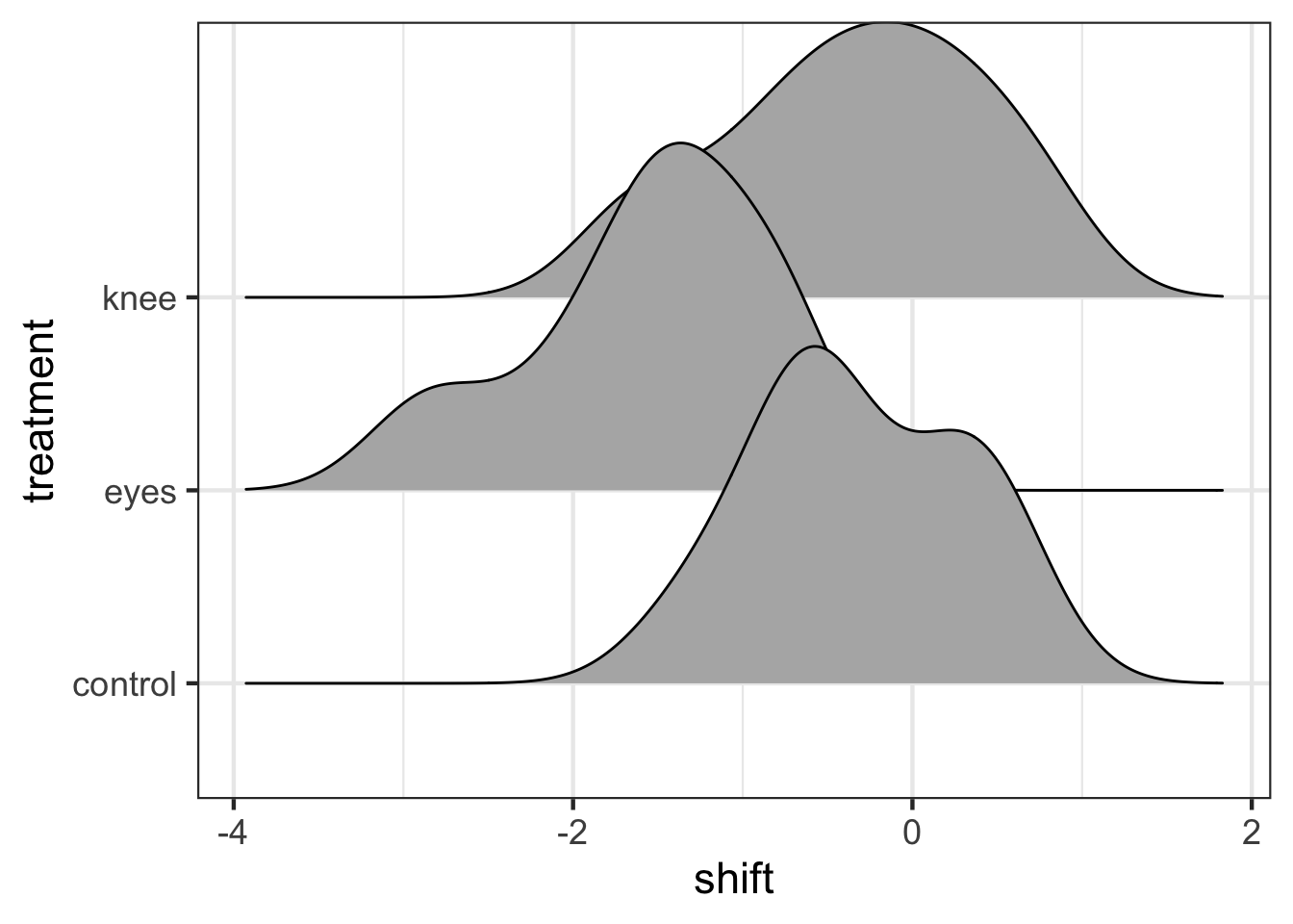
This is great! But I’d argue, there are some more fun and interesting ways to look at this. The ggdist package and ggridges can create some interesting visualizations with additional information.

For example, from ggridges

library(ggridges)

ggplot(data = knees,
       mapping = aes(x = shift, y = treatment)) +
  stat_density_ridges()

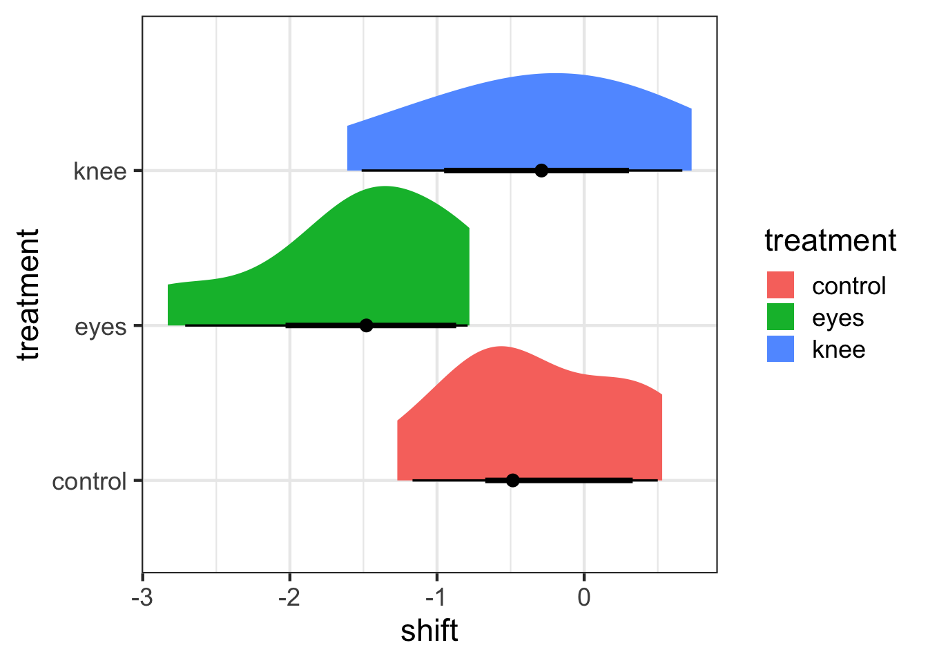
This might be too vague - or it might be great in terms of seeing overlap. ggdist combined a few different elements. I’m a big fan of geom_halfeye as you get a density and mean and CI.

library(ggdist)

ggplot(data = knees,
       mapping = aes(y = treatment, x = shift,
                     fill = treatment)) +
  stat_halfeye()

These densities are more based on the data, and a lot of this provides a clearer cleaner visualization. There are a lot of other interesting elements of ggdist that are worth exploring

ggplot(data = knees,
       mapping = aes(y = treatment, x = shift,
                     fill = treatment)) +
  stat_dist_dotsinterval()

But, as an exercise why not visit the ggdist webpage and try and come up with the most interesting visualization of the knees project that you can!

2.3.2 A Priori Planned Contrasts

If you have a priori contrasts, you can use the constrat library to test them. You give contrast an a list and a b list. Then we get all comparisons of a v. b, in order. It’s not great syntactically, but, it lets you do some pretty creative things.

contrast::contrast(knees_lm, 
         a = list(treatment = "control"), 
         b = list(treatment = "eyes"))
lm model parameter contrast

  Contrast      S.E.     Lower    Upper    t df Pr(>|t|)
1 1.242679 0.3643283 0.4801306 2.005227 3.41 19   0.0029

2.3.3 Unplanned pairwise comparisons

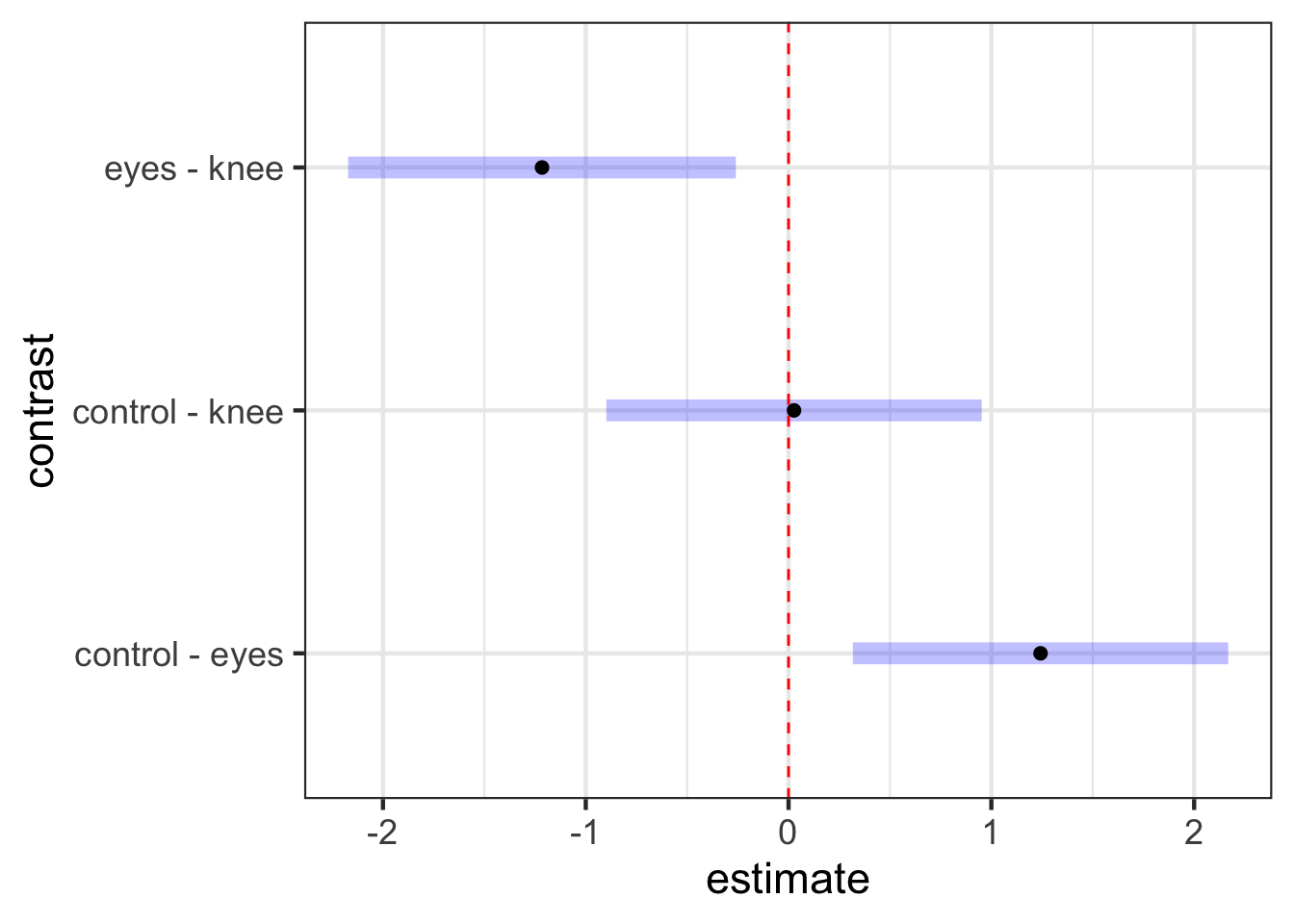
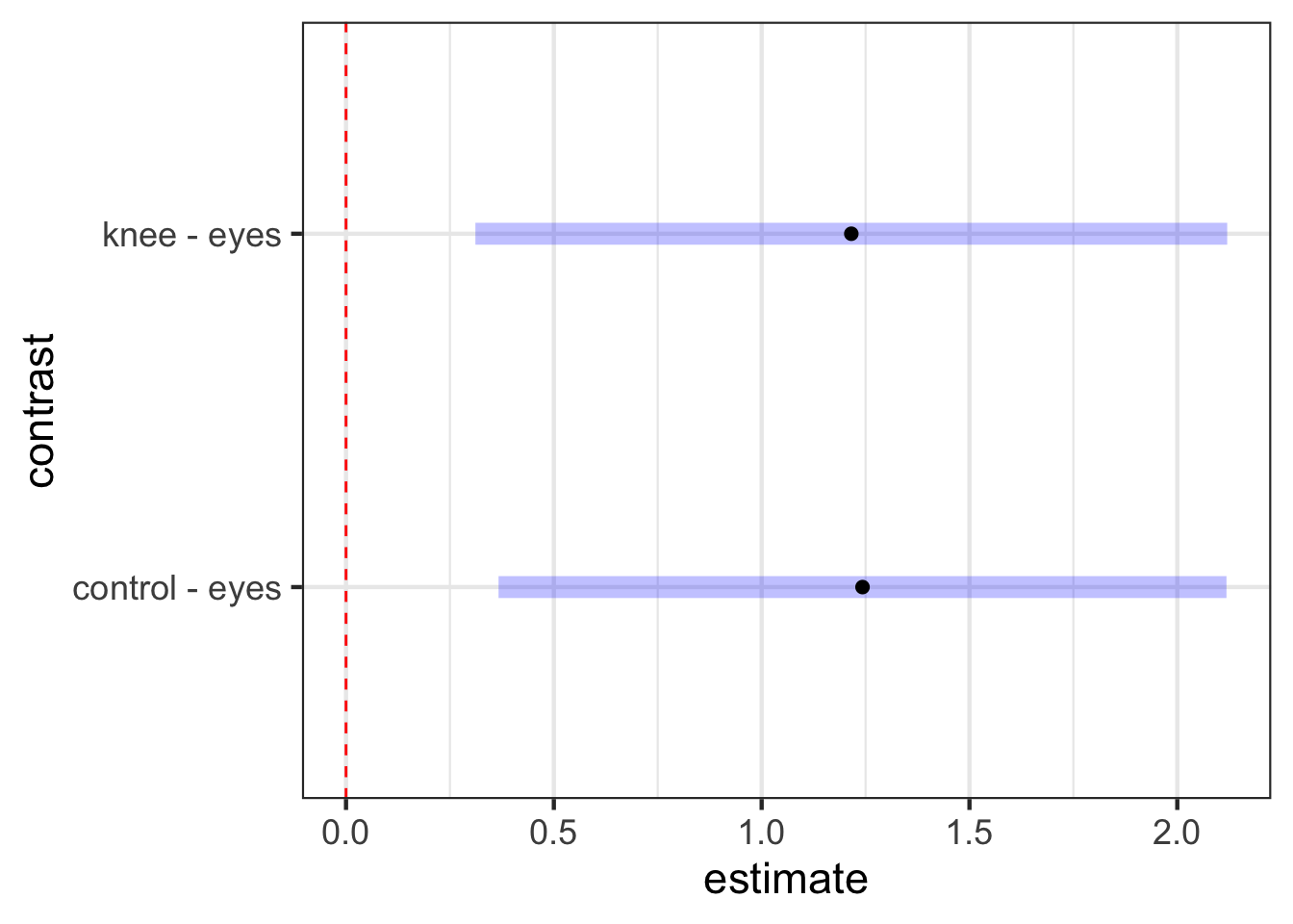
Meh. 9 times out of 10 we want to do compare all possible levels of a categorical variable and look at which differences have cofidence intervals that contain 0. We can use our emmeans object here along with the contrast() function and confint(). Note, by default, confidence intervals will be adjusted using the Tukey method of adjustment.

knees_em <- emmeans(knees_lm, specs =  ~treatment)

contrast(knees_em,
        method = "pairwise") |>
  confint()
 contrast       estimate    SE df lower.CL upper.CL
 control - eyes    1.243 0.364 19    0.317    2.168
 control - knee    0.027 0.364 19   -0.899    0.953
 eyes - knee      -1.216 0.376 19   -2.172   -0.260

Confidence level used: 0.95 
Conf-level adjustment: tukey method for comparing a family of 3 estimates 

We don’t need to worry about many of the fancier things that emmeans does for the moment - those will become more useful with other models. But, we can look at this test a few different ways. First, we can visualize it

contrast(knees_em,
        method = "pairwise") |>
  plot() +
  geom_vline(xintercept = 0, color = "red", lty=2)

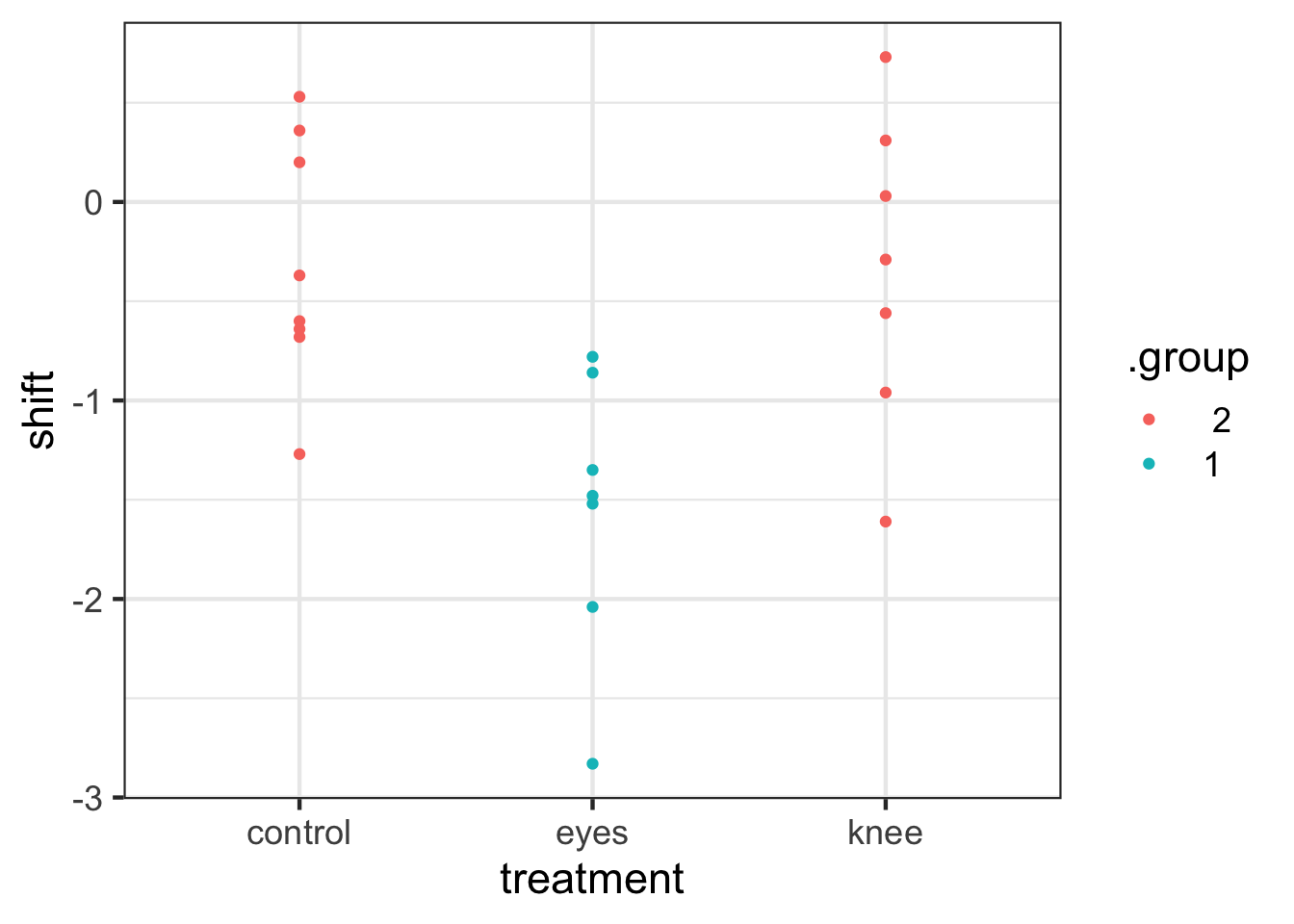
We can also, using our tukey method of adjustment, get “groups” - i.e., see which groups are likely the same versus different.
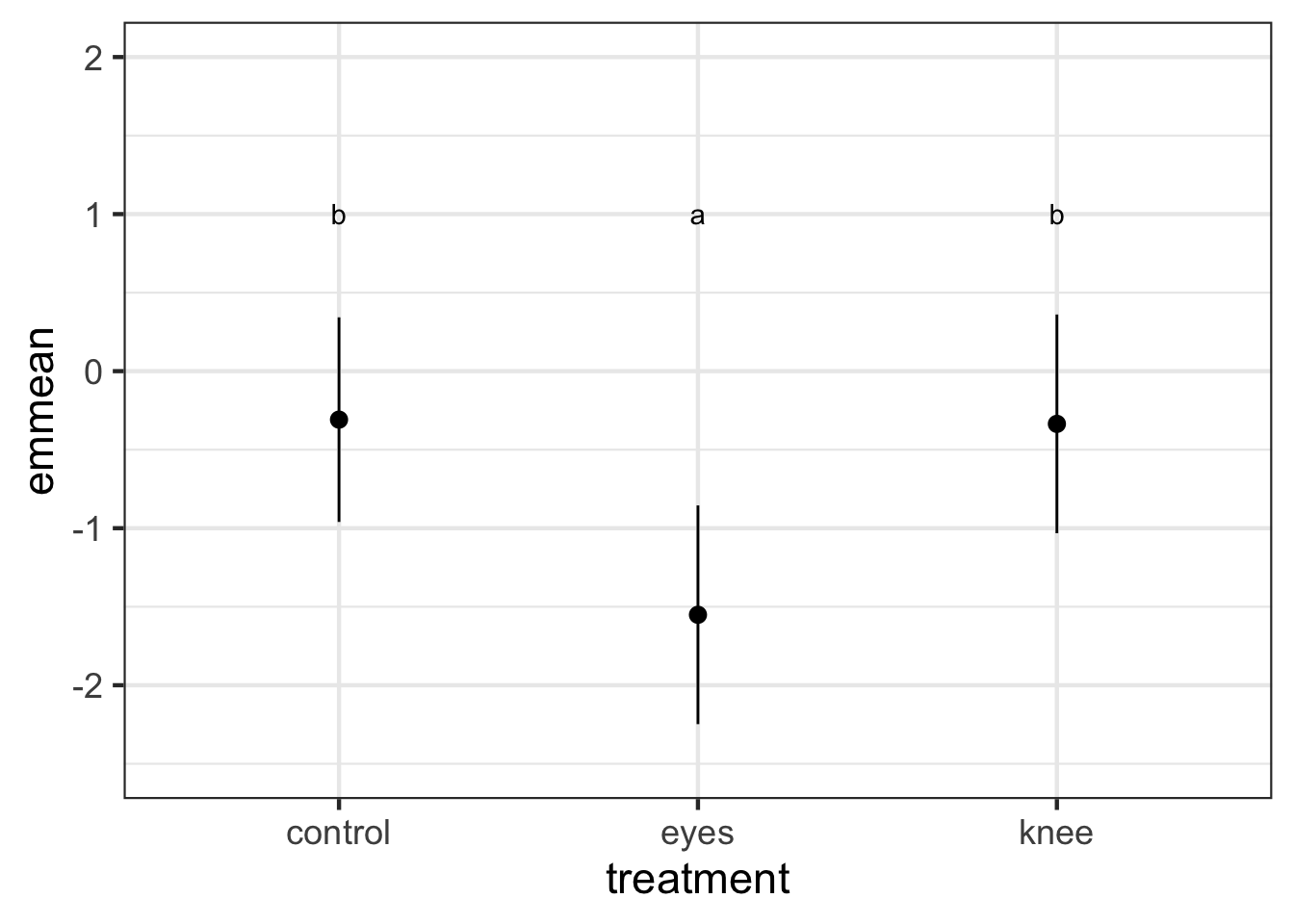
library(multcomp)
cld(knees_em, adjust="tukey")
 treatment emmean    SE df lower.CL upper.CL .group
 eyes      -1.551 0.266 19    -2.25   -0.855  1    
 knee      -0.336 0.266 19    -1.03    0.361   2   
 control   -0.309 0.249 19    -0.96    0.343   2   

Confidence level used: 0.95 
Conf-level adjustment: sidak method for 3 estimates 
P value adjustment: tukey method for comparing a family of 3 estimates 
significance level used: alpha = 0.05 
NOTE: If two or more means share the same grouping symbol,
      then we cannot show them to be different.
      But we also did not show them to be the same. 

This can be very useful in plotting. For example, we can use that output as a data frame for a ggplot in a few different ways.

cld(knees_em, adjust="tukey") %>%
  ggplot(aes(x = treatment, y = emmean, 
             ymin = lower.CL, ymax = upper.CL,
             color = factor(.group))) +
  geom_pointrange() 

cld(knees_em, adjust="tukey") %>%
  mutate(.group = letters[as.numeric(.group)]) %>%
  ggplot(aes(x = treatment, y = emmean, 
             ymin = lower.CL, ymax = upper.CL)) +
  geom_pointrange() +
  geom_text(mapping = aes(label = .group), y = rep(1, 3)) +
  ylim(c(-2.5, 2))

knees_expanded <- left_join(knees, cld(knees_em, adjust="tukey"))
ggplot(knees_expanded,
       aes(x = treatment, y = shift, color = .group)) + 
  geom_point()

Comparing to a Control

We can similarly use this to look at a Dunnett’s test, which compares against the control

contrast(knees_em,
        method = "dunnett") |>
  confint()
 contrast       estimate    SE df lower.CL upper.CL
 eyes - control   -1.243 0.364 19   -2.118   -0.367
 knee - control   -0.027 0.364 19   -0.903    0.849

Confidence level used: 0.95 
Conf-level adjustment: dunnettx method for 2 estimates 

Note, if the “control” had not been the first treatment, you can either re-order the factor using forcats or just specify which of the levels is the control. For example, eyes is the second treatment. Let’s make it our new reference.

contrast(knees_em,
        method = "dunnett", ref=2) |>
  confint()
 contrast       estimate    SE df lower.CL upper.CL
 control - eyes     1.24 0.364 19    0.367     2.12
 knee - eyes        1.22 0.376 19    0.311     2.12

Confidence level used: 0.95 
Conf-level adjustment: dunnettx method for 2 estimates 

You can even plot these results

plot(contrast(knees_em,
        method = "dunnett", ref=2)) +
  geom_vline(xintercept = 0, color = "red", lty=2)

Bonferonni versus No Correction

Let’s say you wanted to do all pairwise tests, but, compare using a Bonferroni correction or FDR. Or none! No problem! There’s an adjust argument

contrast(knees_em,
        method = "pairwise") |>
  confint(adjust="bonferroni")
 contrast       estimate    SE df lower.CL upper.CL
 control - eyes    1.243 0.364 19    0.286    2.199
 control - knee    0.027 0.364 19   -0.929    0.983
 eyes - knee      -1.216 0.376 19   -2.203   -0.228

Confidence level used: 0.95 
Conf-level adjustment: bonferroni method for 3 estimates 
contrast(knees_em,
        method = "pairwise") |>
  confint(adjust="none")
 contrast       estimate    SE df lower.CL upper.CL
 control - eyes    1.243 0.364 19    0.480    2.005
 control - knee    0.027 0.364 19   -0.736    0.790
 eyes - knee      -1.216 0.376 19   -2.003   -0.428

Confidence level used: 0.95 

2.4 Faded Examples

Let’s try three ANOVAs! First - do landscape characteristics affect the number of generations plant species can exist before local extinction?

plants <- read.csv("lab/data/10/15q01PlantPopulationPersistence.csv")

#Visualize
ggplot(plants,
      aes(x = treatment, y = generations)) +
      geom_boxplot()

#fit
plant_lm <- lm(generations ~ treatment, data=plants)

#assumptions
check_model(plant_lm)

#evaluate
tidy(plant_lm)

r2(plant_lm)

#contrasts
contrast(emmeans(plant_lm, ~treatment), 
         method = "pairwise") |>
  confint()

Second, how do different host types affect nematode longevity?

worms <- read.csv("./data/10/15q19NematodeLifespan.csv")

#Visualize
ggplot(data = _______,
       mapping = aes(x = treatment, y = lifespan)) +
  geom_____________() #feel free to play

#fit
worm_lm <- lm(______ ~ ______, data=worms)

#assumptions
check_model(__________)

#evaluate
tidy(________)

r2(________)

#contrasts
contrast(emmeans(______, ~________), 
         method = "pairwise") |>
  confint()

And last, how about how number of genotypes affect eelgrass productivity. Note, THERE IS A TRAP HERE. Look at your dataset before you do ANYTHING.

eelgrass <- read.csv("labs/data/10/15q05EelgrassGenotypes.csv")

#DO SOMETHING HERE

#Visualize
________(data = _________,
         mapping = aes(x = treatment.genotypes, y = shoots)) +
  ___________

#fit
eelgrass_lm <- __(______ ~ ______, data=________)

#assumptions
________(______)

#evaluate
________(______)

________(______)

#contrasts
contrast(emmeans(_________, ~_________), 
         method = "_________") |>
  _________()